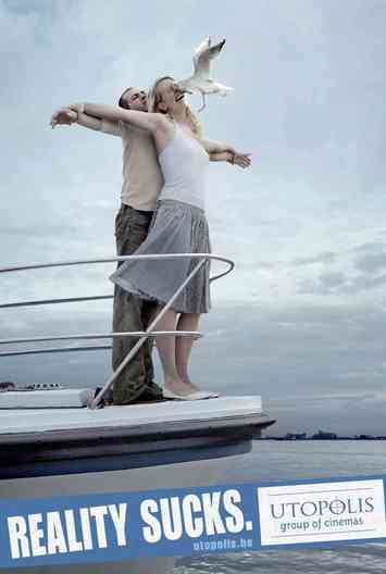
While browsing one of my favorite website, this particular ad was showcased in a collection of very funny ads. I have to say that I found it pretty hilarious and very enjoyable, especially when I saw the product it was advertising. This is the iconic image of “Jack, I’m flying” from Titanic; it’s world famous and has been recreated numerous times by fans of James Cameron’s epic. This is one of the many reasons why I think that the ad’s headline is very effective.
To understand why this ad is successful, I have to explain the criteria of a great headline. According to Altstiel & Grow in their textbook Adverting Creative, a great headline does one or more of the following things: Immediately gain the audience’s attention, select the right prospect, lead readers into the text, and complete the creative equation. The first thing an ad has to do, is grab the viewer’s eye, cut through the clutter, and get them to, as Sullivan stated, “lean in.” This is the one of the most important, if not the most important, element in creating and determining if a headline is successful. From there, a successful headline can select the right prospect, which means that the ad’s message is (for lack of a better term) “gelling” with the audience, and connecting with them on some level. It’s that instantaneous, almost subconscious, connection that the headline shares with the viewer; it feels right.
A great headline will then lead the viewer into the rest of the ad, specifically the text. The headline is the teaser, the taste, which draws the audience’s attention to the main course. As David Ogilvy put it, the headline is “the ticket on the meat” (Sullivan, 2012). Finally, the last element of a great headline is that it completes the creative equation. This means that a headline works with the visuals to create a synergy of creative output; together they form one cohesive creative message, style, and feel.
Doing further research into this campaign, I found that other ads feature more iconic images and showing them as they would really be: awful and depressing. The juxtaposition of “movie” and reality creates dark humor, and when paired with the headline “reality sucks” serves the purpose of showing the viewer that going to the movies (the intended result) is much better than real life. This was clearly the strategy. All in all, Id’s say that this headline is very successful because it got my attention, connected with me, lead me into the rest of the ad, and fit extremely well with the visuals. It also made me laugh and search for more. If I had to create one of these ads, I’d have a famous movie image, say Indiana Jones, I’d have him be crushed by the boulder. Then say, “Get away from it all”. It ties into the campaigns theme of escapism, and it plays off the dark humor of the juxtaposition.
Citations:
Altstiel, T. & Grow, J. (2013). Advertising Creative: Strategy, Copy, and Design (3rd Edition.). Los Angeles: Sage.
Sullivan, L. (2012). Hey Whipple Squeeze This: The Classic Guide to Creating Great Ads (4th Edition).
Word Count: 492
 RSS Feed
